
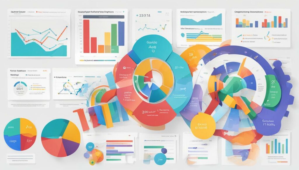
Reporting is an important aspect of any business, and Google Data Studio provides a powerful tool that enables you to create visually engaging reports that clearly communicate your data insights.
Key Takeaways:
- Google Data Studio is a powerful reporting tool.
- Effective reporting can help you communicate your data insights.
- Our guide will provide tips on designing engaging dashboards, organising data for clear visualisations, utilising advanced features, automating updates and reporting, and optimising report performance.
Why Use Google Data Studio for Reporting?
At MECHANYSM, we love using Google Data Studio for reporting. Not only is it a fantastic tool offered by Google, but it’s also free! Here’s why we think you should consider using it for your reporting needs:
- It’s easy to use: Google Data Studio has a user-friendly interface that makes it easy for anyone to create dashboards and reports with no coding experience required. This means that you can create custom reports tailored to your specific needs without needing to hire a developer.
- It’s customisable: With Data Studio, you can customise your reports with your company’s branding and style guide, making your reports look professional and polished.
- It’s shareable: You can easily share your reports with others in your organisation or with clients, allowing them to see up-to-date data at any time.
- It’s scalable: Whether you have a small company or a large enterprise, Data Studio allows you to scale your reports to meet your needs.
- It’s powerful: Data Studio integrates with other Google products like Google Analytics, Google Ads, and Google Sheets, giving you access to a wealth of data to create powerful reports.
Why Use Google Data Studio for Reporting? A Deeper Look
Let’s dive a little deeper into each of these points to see why Google Data Studio is such a great choice for reporting.
Easy to use: Google Data Studio is designed to be easy to use. It has a drag-and-drop interface that allows you to create custom reports without needing to write any code. You can add charts, graphs, tables, and other visual elements to your reports with just a few clicks.
Customisable: With Data Studio, you can customise your reports to match your company’s branding and style guide. You can add your company’s logo, fonts, and colors to your reports, making them look professional and polished.
Shareable: One of the best things about Data Studio is how easy it is to share your reports. You can share your reports with anyone who has a Google account, which means you can easily share reports with others in your organisation or with clients. You can also set up automatic updates so that your reports are always up-to-date.
Scalable: Whether you’re a small business or a large enterprise, Data Studio can scale to meet your needs. You can create reports for a single website or for multiple websites. You can also create reports for different departments or teams within your organisation.
Powerful: Data Studio integrates with other Google products like Google Analytics, Google Ads, and Google Sheets, giving you access to a wealth of data to create powerful reports. You can create reports that show website traffic, conversion rates, advertising performance, and much more.
Overall, Google Data Studio is a powerful tool that can help you create custom reports that are tailored to your specific needs. It’s easy to use, customisable, shareable, scalable, and powerful. If you’re not already using Data Studio for your reporting needs, we highly recommend giving it a try.
Designing Engaging Dashboards
When it comes to reporting, a well-designed dashboard can make all the difference. Dashboards are a visual representation of your data, and they can help you quickly identify trends, track progress, and make informed decisions. In Google Data Studio, there are several ways to design engaging dashboards that will make your data come to life.
Choosing the Right Charts
One of the first things to consider when designing a dashboard is the type of charts you want to use. Google Data Studio offers a wide range of chart options, including line charts, bar charts, pie charts, and more. It’s important to choose the right chart for your data, as different charts are better suited to different types of data.
For example, if you’re tracking changes over time, a line chart might be the best option. If you’re comparing multiple data points, a bar chart might work better. And if you’re showing proportions or percentages, a pie chart could be the way to go.
Adding Interactivity
Another way to make your dashboards more engaging is to add interactivity. Google Data Studio allows you to add filters, date ranges, and other interactive features that allow users to explore the data in more detail.
For example, you could add a filter that allows users to view the data for specific regions, or a date range selector that allows them to view data for a specific time period. This not only makes the dashboard more engaging but also allows users to gain deeper insights into the data.
Designing for Mobile
With more and more people accessing data on their mobile devices, it’s important to design your dashboard with mobile in mind. Google Data Studio allows you to create responsive designs that adapt to different screen sizes, ensuring that your dashboard looks great no matter how it’s viewed.
When designing for mobile, it’s important to keep things simple and avoid clutter. Use larger text and bigger buttons to make it easy for users to navigate the dashboard on a small screen. Consider using charts that are easy to read on a small screen, like bar charts or pie charts.
Summary
Designing engaging dashboards in Google Data Studio is all about choosing the right charts, adding interactivity, and designing for mobile. By following these tips, you can create dashboards that are not only visually appealing, but also provide valuable insights into your data.
Organising Data for Clear Visualisations
One of the key benefits of Google Data Studio is the ability to create visually appealing reports that are easy to understand. However, this depends heavily on the quality of the data that is included in your report and how it is organised.
Start by selecting the most relevant data for your report. This will ensure that your report is focused and delivers the information your audience needs. Next, organise your data in a logical and consistent manner. This can be achieved by grouping related data together and presenting it in a way that is easy to digest.
When selecting the type of chart or graph to use, it’s important to consider how the data will be presented and what insights you want to convey. Line charts are great for showing trends over time, while pie charts are useful for showing how data is distributed.
Organising Data With Tables
If you have a lot of data to present, tables can be a good option. Tables allow you to present large amounts of data in a clear and concise manner. When creating a table, be sure to include clear headers for each column and row. This will help your audience understand what each data point represents.
| Product | Units Sold | Revenue |
|---|---|---|
| Product A | 100 | £10,000 |
| Product B | 200 | £20,000 |
| Product C | 50 | £5,000 |
Using Visualisations to Highlight Key Insights
In addition to tables, visualisations such as charts and graphs can be used to help highlight key insights in your data. When creating a visualisation, it’s important to choose the right type of chart or graph for the data being presented. This will help to ensure that the insights are clear and easy to understand.
Other visualisations like maps can be used to show geographic data such as sales in different regions. Adding colors and tooltips can help draw attention to specific data points and provide further context to the map.
Remember, the goal of your report is to provide insights that are easy to understand and act upon. By organising your data in a clear and consistent manner, and using visualisations that highlight key insights, you can create reports that are both informative and visually appealing.
Utilising Data Studio’s Advanced Features
Once you have mastered the basic features of Google Data Studio, it’s time to explore some of its more advanced functionality. In this section, we’ll take a closer look at some of the advanced features of Data Studio and how they can help you create more powerful reports.
Advanced Filters
Data Studio’s advanced filters allow you to create more complex filtering criteria than the basic filters. For example, you can use regular expressions to filter data, or create filters based on multiple conditions using boolean expressions. This feature is especially useful when dealing with large datasets.
Calculated Fields
Calculated fields allow you to perform calculations on your data within Data Studio. With this feature, you can create custom metrics and dimensions that are not available in your original data source. This is particularly helpful when you need to perform complex calculations or customise your reporting metrics.
Interactive Reports
Data Studio’s interactive reports enable you to build reports that allow users to interact with the data. Users can interact with the report by clicking on elements, such as charts and tables, to drill down into the data or change the view. This feature provides a more engaging and interactive experience for your users.
Data Blending
Data blending allows you to combine data from multiple sources into a single report. This means that you can blend data from different sources, such as Google Analytics and Google Ads, to create a more comprehensive report. This feature is particularly useful when you need to create a report that combines data from different platforms.
By utilising these advanced features, you can take your reporting to the next level and create more powerful and effective reports. With Data Studio’s flexibility and functionality, the possibilities are endless.
Incorporating Custom Metrics and Dimensions
One of the best features of Google Data Studio is the ability to create custom metrics and dimensions to further analyze your data. Custom metrics allow you to define your own calculations based on existing metrics, while custom dimensions allow you to segment your data in unique ways.
To create a custom metric, navigate to a chart or table and click the “Add a Metric” button. From there, select “Create Field” and input your formula. You can use arithmetic operators, and functions, and reference existing metrics to create your custom metric. Once saved, your custom metric will be available to use in any chart or table within your report.
Custom dimensions can be created in a similar way, however, they are created within the data source rather than within a chart or table. Simply navigate to the data source and select “Add a Field”. From there, input your formula to create your custom dimension. Once created, your custom dimension can be used within any chart or table within your report.
When to Use Custom Metrics and Dimensions
Custom metrics and dimensions can be extremely powerful tools in Data Studio reporting. They allow for more granular analysis and can help you better understand your data. One example of when to use custom metrics is when you want to calculate a metric that is not available within your data source. For example, you may want to calculate the conversion rate of a specific campaign, which is not available in your source data.
Custom dimensions can also be useful in segmenting your data in unique ways. For example, if you want to analyze the performance of a specific product category within your E-commerce store, you can create a custom dimension based on that category.
Overall, custom metrics and dimensions are powerful tools that can significantly enhance your reporting capabilities within Data Studio. By utilising them effectively, you can gain deeper insights into your data and make more informed decisions.
Automating Data Updates and Reporting
When it comes to reporting, keeping data up-to-date is crucial to making informed decisions. However, manually updating data can be labour-intensive and time-consuming, leaving little room for analysis. This is where automating data updates and reporting through Google Data Studio comes in handy.
One of the most significant advantages of automating data updates on Google Data Studio is the ability to save time. Instead of spending hours compiling and organising data, automated updates take care of it for you – leaving more time to focus on analyzing and interpreting insights.
Not only does automating data updates save time, but it also reduces the likelihood of mistakes due to human error. By setting up automatic refreshes, you can be confident that your data is always accurate and up-to-date. Additionally, when multiple people are involved in reporting, automating data updates ensures everyone is working with the same accurate information.
When it comes to automating reporting processes in Google Data Studio, there are several ways to do so. You can schedule automatic reports to be sent via email to yourself or your team. This way, you can ensure everyone has access to the latest data without having to manually send reports each time. Reports can also be published to a shared Google Drive folder, allowing team members to access them at their convenience.
Another way to automate reporting is to set up triggers that notify you when specific events occur, such as when a goal is reached or when data exceeds a certain threshold. This allows you to take action immediately, rather than having to monitor data constantly.
Overall, automating data updates and reporting is an excellent way to save time, minimise errors, and ensure everyone is working with the same accurate information. With Google Data Studio, it’s easy to automate these processes and enjoy the benefits of more efficient reporting.
Collaborating and Sharing Reports
Working in teams is essential for success, which is why Google Data Studio makes it easy to collaborate and share reports with colleagues.
Whether you need to get feedback from your team, share your progress with your boss, or give your clients access to their reports, Data Studio offers several ways to collaborate and share the insights you’ve gathered.
Sharing Reports
Sharing your reports with colleagues or clients is easy. Simply click on the “Share” button in the top right corner of the report editor and choose the people you want to share it with.
You can choose to give your collaborators different levels of access, such as “edit,” “comment,” or “view.” This allows you to control who can make changes to the report and who can only view it.
You can also choose to share your report as a PDF or as a link. This gives your collaborators the ability to view your report in their preferred format or share it with others outside your team or organisation.
Collaborating on Reports
Collaborating on reports allows your team to work together in real time, providing feedback and making changes as needed.
Data Studio’s collaboration features allow multiple people to work on the same report simultaneously. This means you can make changes to the report while someone else is working on it, without having to worry about losing your work.
Collaborating on reports also gives your team the ability to communicate about the report using the commenting feature. You can leave comments on specific charts or tables, which makes it easy to discuss specific data points or insights.
By collaborating and sharing reports, you can ensure that everyone on your team is on the same page and that your reports are accurate and up-to-date.
Optimising Report Performance
As we delve deeper into the world of Google Data Studio, it’s important to note that optimising report performance is crucial for delivering the best possible experience for our clients. Here are some tips to ensure smooth and quick loading of reports.
1. Reduce Data Sampling
Data sampling can be useful for large datasets, but it can also impact report performance. To ensure that your report runs smoothly, try to keep data sampling to a minimum and use other filters and aggregations to limit your data instead.
2. Limit the Use of Blended Data Sources
Blending data sources in Google Data Studio can be a powerful tool, but it can also impact report performance. Try to limit the use of blended data sources in your reports and instead use native data sources whenever possible.
3. Use Aggregation and Calculated Fields
Using aggregation and calculated fields can help to reduce the amount of processing required by Google Data Studio. By pre-processing your data, you can improve report performance and reduce the amount of time it takes to load your reports.
4. Avoid Using Complex Charts and Tables
Complex charts and tables can impact report performance by requiring additional processing power and memory to generate. Try to use simpler charts and tables whenever possible to ensure that your reports load quickly and smoothly.
5. Utilise Caching
Caching is a useful tool for optimising report performance, particularly when dealing with large datasets. By caching your data, you can reduce the amount of processing required by Google Data Studio and improve report loading times.
By implementing these five tips, you can ensure that your Google Data Studio reports run smoothly and quickly, delivering the best possible experience for you and your clients.
Conclusion
In conclusion, Google Data Studio is an incredibly powerful tool for reporting and visualising data. By following these tips, we can create engaging and informative dashboards, organise our data for clear visualisations, and utilise advanced features to gain deeper insights. Incorporating custom metrics and dimensions, automating data updates and reporting, and collaborating and sharing reports are all essential to maximise the benefits of Data Studio. Additionally, optimising report performance is crucial to ensure smooth and efficient operations. With Data Studio, we can easily create stunning reports that deliver actionable insights and add value to our businesses. So what are you waiting for? Get started with Google Data Studio today and take your reporting to the next level!
FAQ
Q: What are some reporting tips for Google Data Studio?
A: Some reporting tips for Google Data Studio include…
Q: Why should I use Google Data Studio for reporting?
A: You should use Google Data Studio for reporting because…
Q: How can I design engaging dashboards?
A: To design engaging dashboards, you can…
Q: How do I organise data for clear visualisations?
A: To organise data for clear visualisations, you can…
Q: What are some advanced features of Data Studio?
A: Some advanced features of Data Studio include…
Q: How can I incorporate custom metrics and dimensions?
A: To incorporate custom metrics and dimensions, you can…
Q: How can I automate data updates and reporting?
A: To automate data updates and reporting, you can…
Q: How do I collaborate and share reports in Data Studio?
A: To collaborate and share reports in Data Studio, you can…
Q: How can I optimise report performance in Data Studio?
A: To optimise report performance in Data Studio, you can…
Q: What is the conclusion of using Google Data Studio for reporting?
A: The conclusion of using Google Data Studio for reporting is…